Val’s Vegan Kitchen App - Ordering and Menu Updating
App DesignVal’s Vegan Kitchen is a casual dining restaurant which offers a wide variety of vegan option foods. With the current times, mobile usage has been more prominent than ever, and such cultural shifts include the emergence of food apps.
Val’s Vegan Kitchen wants to adapt to this. However, their large variety of products makes easy, intuitive viewing on a menu challenging for both the customer and client. The design challenge is to create an ordering app for Val’s Vegan Kitchen with proper features implemented to improve the user experience for customers and clients. This includes menu ordering and menu updating.
Skills
User Interviews & Testing
Competitive Analysis
Wireframing
Prototyping
Tools
Figma
Google Sheets (Competitive Analysis)
Google Docs (User Interviews)
COGS 187A: Usability and Information Architecture Final Project
Wireframing, Initial Challenges & Competitor Analysis
The main problems we encountered throughout the design process were in the creation of the initial prototype, including figuring out how we wanted to format each page and what sequence of pages we should design. For instance, the homepage could introduce users to the restaurant or brand, or alternatively allow users to directly access the menu for quick ordering.
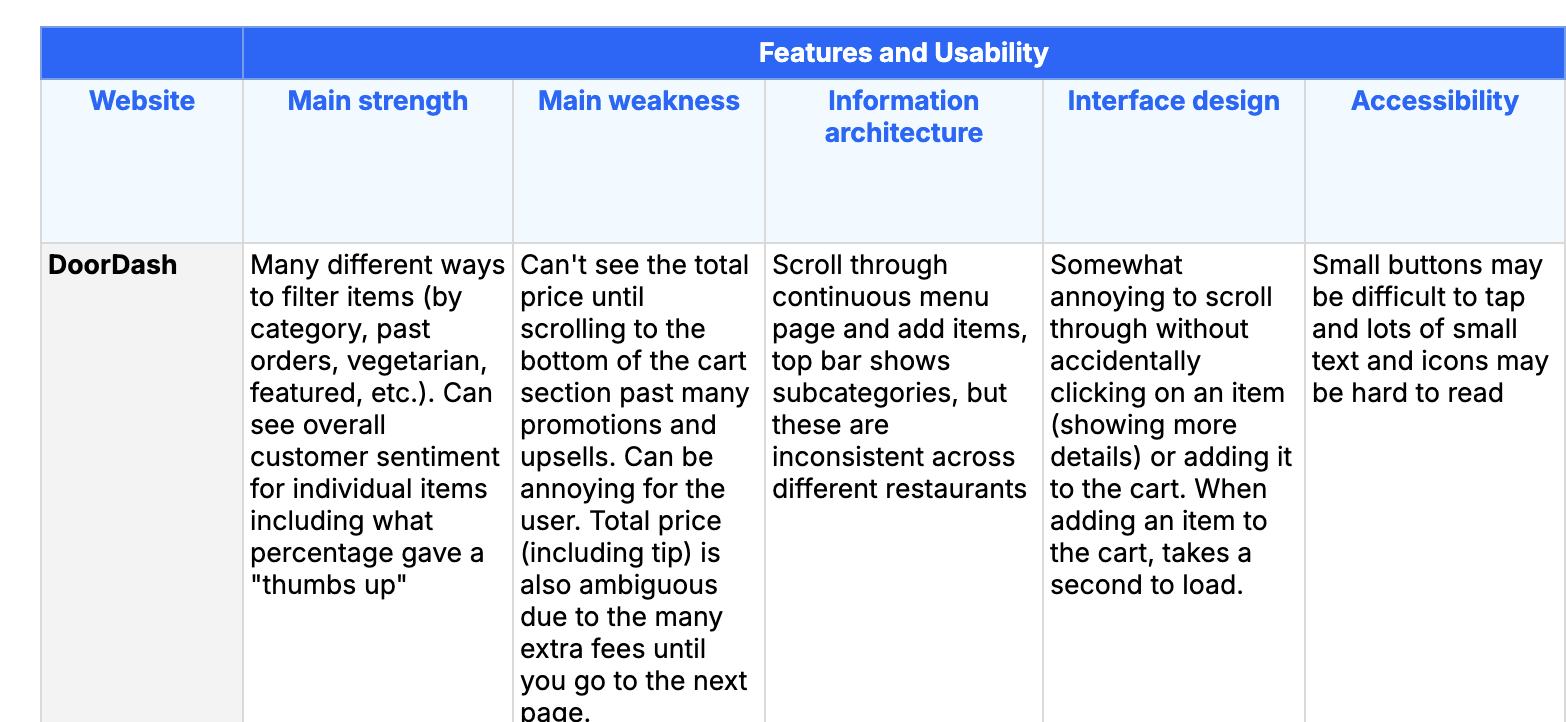
In our competitive analysis, we reviewed the information architecture, interface design, and accessibility of similar food-ordering apps, including DoorDash, Taco Bell, Starbucks, and Cava. Each app was distinct in its layout and user flow to emphasize company values and their main customer demographics. For instance, Starbucks highly incentivized frequent, routine ordering by making reordering previous items extremely accessible and by encouraging loyalty through their Stars rewards program.
We found that many of the competitor apps made pricing ambiguous until the payment page, possibly to incentivize making larger purchases or to avoid customers being discouraged by prices that were higher than expected.
All of the competitors we analyzed made some use of grouping in their menu, categorically dividing menu items. Starbucks, Taco Bell, and Cava split their item menus into separate pages, while DoorDash made use of a continuous scrolling menu.
As mentioned, each of the competitors had varying user flows. This proved to be beneficial for our prototyping, allowing us to take inspiration from or defer from. An example of which was the user flow of a customer adding additional items from checkout. Taco Bell had additional items under their cart page, but another page for additional items before finally proceeding to the checkout page (i.e. pressing the checkout button at the cart page leads to the additional items page, which will finally lead to checkout after pressing skip). This differs from Starbucks, where such an additional page does not exist. Although Taco Bell’s additional page was excessive, Starbucks’s additional items were lacking customization.
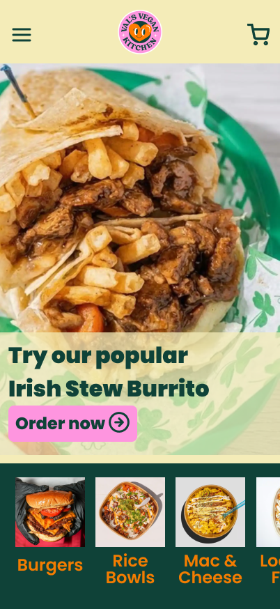
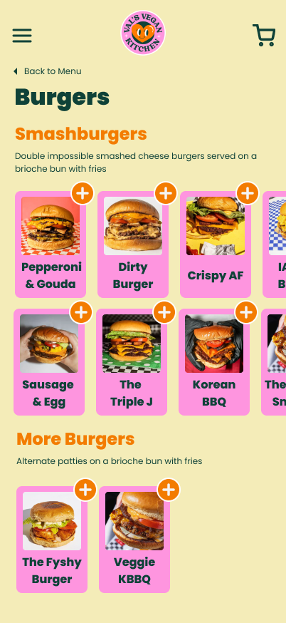
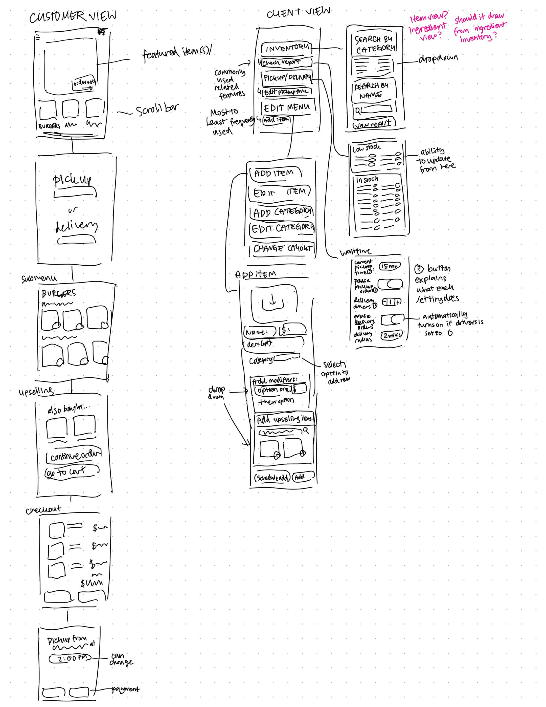
Initial sketch and wireframing.
One uncertainty which arose was the designing of the Pick-Up prototype. Because most food apps are designed for chain restaurants, including Taco Bell, Starbucks, and Cava, we were accustomed to having the option of selecting a specific location from a set of options. However, with Val’s Vegan Kitchen being only one restaurant, we were unsure how to specifically tackle it. If users were returning customers or already had knowledge of the location, an informational screen could potentially make the app more tedious to use. An example would be whether or not the Google Maps integration would be as applicable here compared to an app like Burger King.
User Testing
As a part of the design process, we used user testing to gain insight into how to best improve our initial design and to identify problematic areas in the user experience. We tested both customer and client (restaurant) user flows to better understand both experiences.
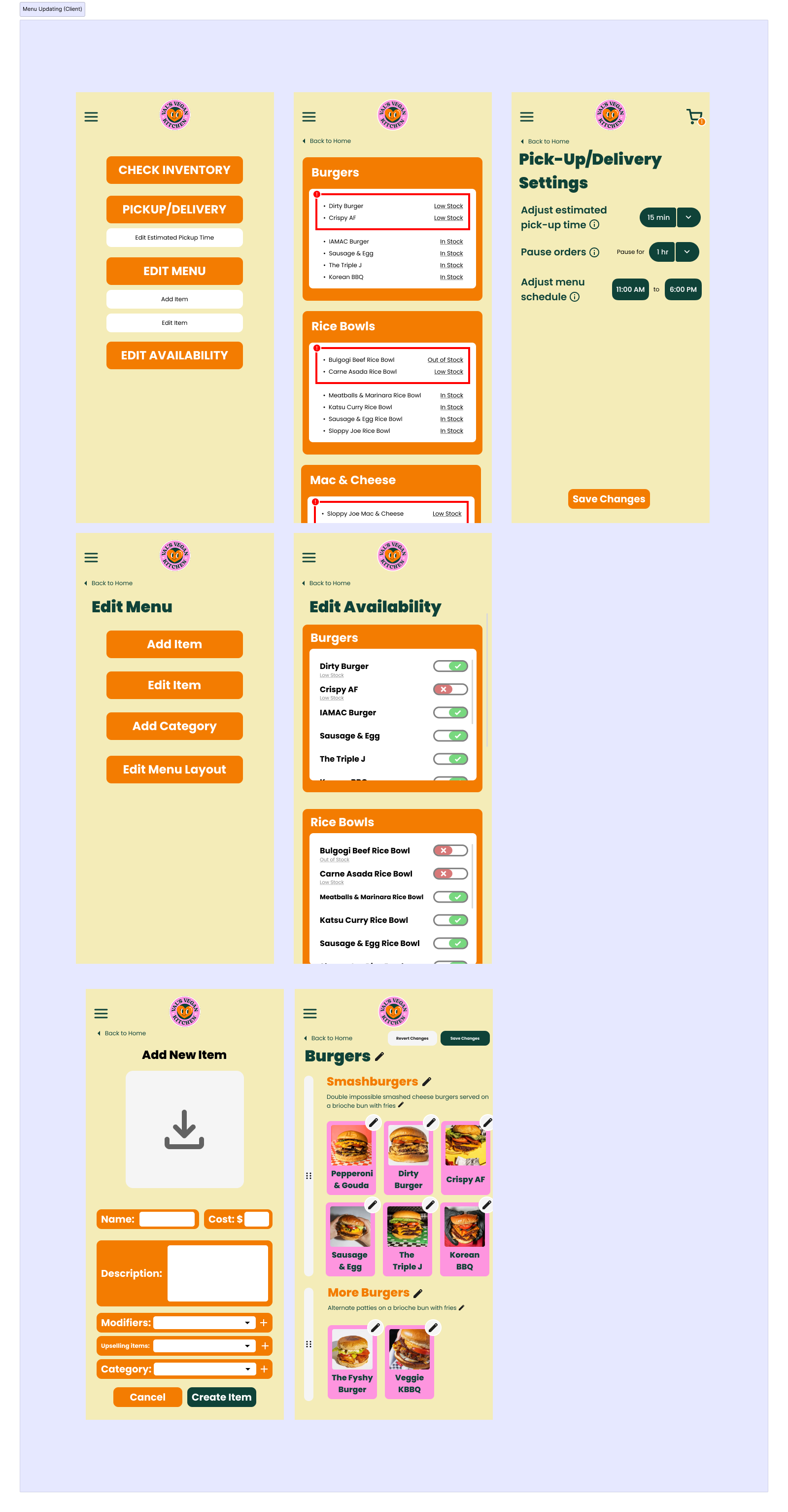
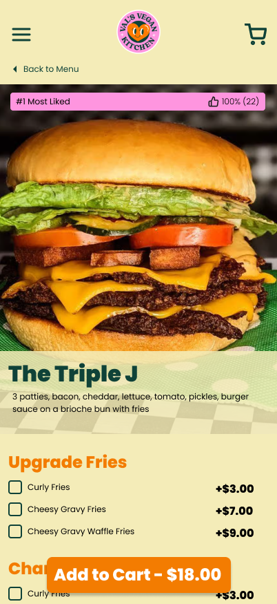
For the customer experience, we tested the ordering experience from beginning to end, prompting users to simulate placing an order. We found users found ambiguity in the individual item page, asking questions like, “Is 22 thumbs up considered good?” and “Upgrade fries?”, not realizing that fries were already included as part of the item. Generally, from a combination of the item name and picture, users assumed that only a burger was included.
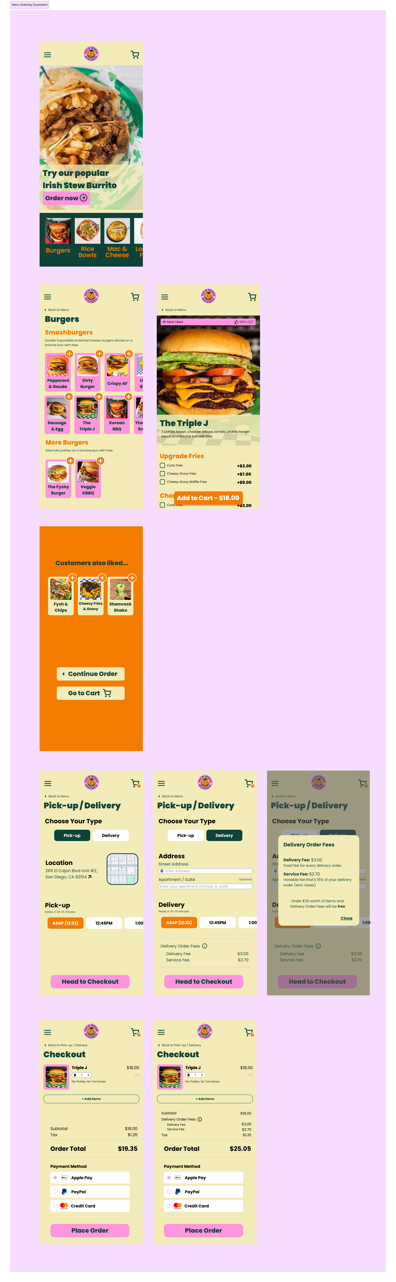
In our prototype, we chose to divide the menu into subcategories like most of the competitor designs. The homepage allows customers to access each category individually. Although this worked well for customers placing an order, the homepage felt intimidating to customers looking to casually browse a menu. One user tester said that they were hesitant to click on a category to browse, since clicking would likely open a new page and felt like a commitment. An option to show all items on one page (like DoorDash) could provide a more accessible option for browsing all options.
Sample of competitive analysis.
The homepage, with item subcategories, and the individual item page.
Redesigning the Inventory Page
One function of the app is to allow client/restaurant users to check the inventory page of menu items, which displays which items are out of stock and allows users to toggle item availability as necessary.
The initial sketch of the inventory page and availability report.
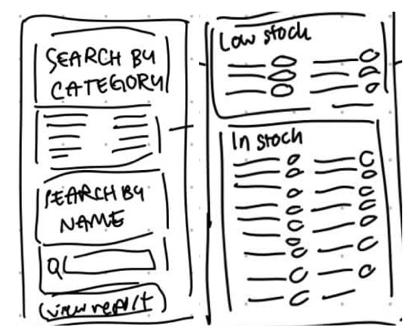
The initial design implementation included a main search page “Inventory”, which allowed users to search items by category or name, as well as linking to a separate “Availability Report” which listed all items and their availability. From our user testing, we found that users struggled to navigate and understand the purpose of the separate search page, and found it tedious to search for multiple items in a row. The “Inventory” page served as an extra obstacle to viewing the “Availability Report”, which was more informative.
One possible redesign avenue we considered was simplifying the user experience by removing the main search page (“Inventory”) completely and adding the ability to search and filter into the “Availability Report” itself. In this proposed redesign, the single page sorts items by menu category, highlighting items that are low in stock. Users can toggle item availability individually or by category. Users can view the entire menu inventory and notice at a glance which items are out of stock or low in stock.
The second possible redesign implements a sort by function where users can sort by Stock (Out of Stock or In Stock) and by Category. Additionally, a search function allows users to identify specific items or search categories.

The first proposed redesign sketch.
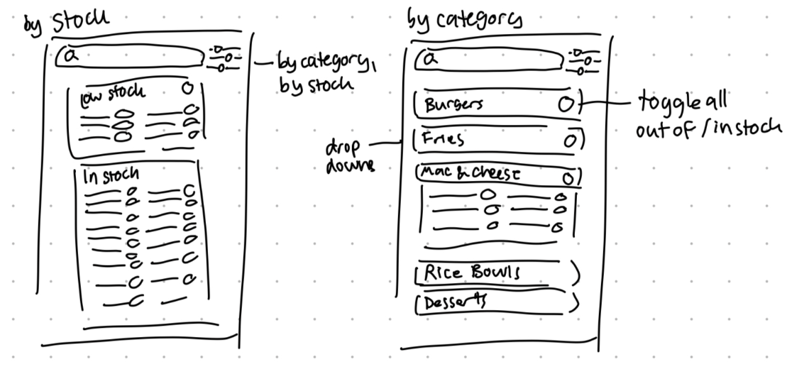
The second proposed redesign sketch.
Some options we considered for making the inventory easier to edit included incorporating pop-up menus for each item rather than separate pages, and allowing for numerical quantity input/adjustment. However, this would likely be better implemented as a separate inventory system such that the app could automatically update item availability based on ingredient availability.
After a brief user test, we decided to implement the first redesign as it is simpler and easier to use overall. By mirroring the menu categorization, the layout and grouping of items is more intuitive for a restaurant worker who is familiar with updating and maintaining the existing menu.
Final Design & Prototype
Our final app mockup can be found here.
The final prototype provides both customer and client functionality.