Wayfinding at the Cooper Hewitt
A decision-point audit of a design museum that’s hard to navigate
Role
Solo project
— field research, behavioral observation, audit framework, CAD documentation, intervention design
Methods
Two site visits (documentation/observation)
Decision-point auditing
Sightline analysis
Plan reconstruction (AutoCAD)
Map annotation (Adobe Illustrator)
Solo Project, July 2026
Overview
The problem. The Cooper Hewitt, Smithsonian Design Museum occupies the landmarked Carnegie Mansion, but its historic residential layout doesn’t always lend well to visitor navigation.
The opportunity. Although The Cooper Hewitt had signs and other artifacts to aid navigation, I found it often took a few seconds to locate or identify them, whether it was because of their size or positioning. I observed as visitors awkwardly navigated stanchions to ask the front desk where key locations like the café were located.
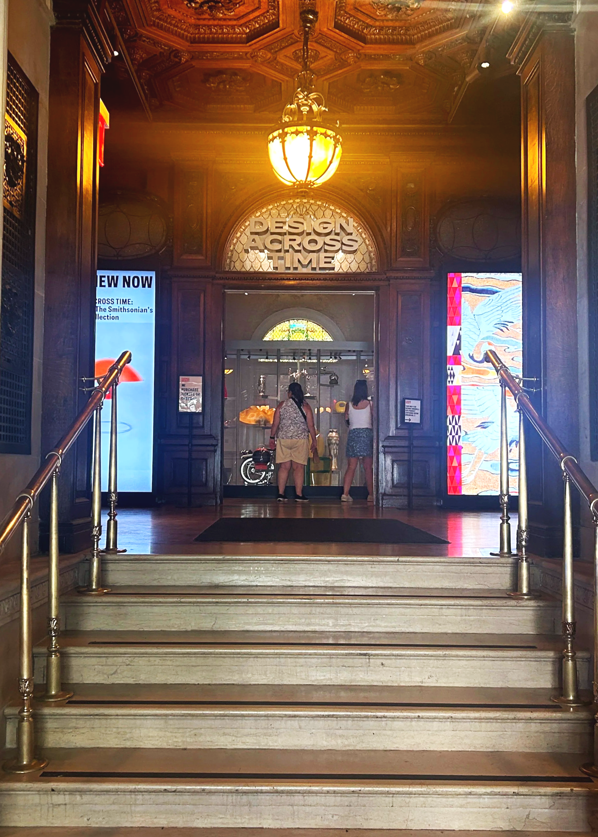
On my first visit to the Cooper Hewitt in July 2026, I was immediately confused upon entering the building. I stood for a moment at the entrance to the main exhibit, my eyes wandering passively across large digital screens as I wondered where to purchase tickets. Upon spotting a tiny sign pointing to a group of tables to my left, I then had to consider whether to continue naturally forward or to backtrack to the main exhibit which initially greeted me.
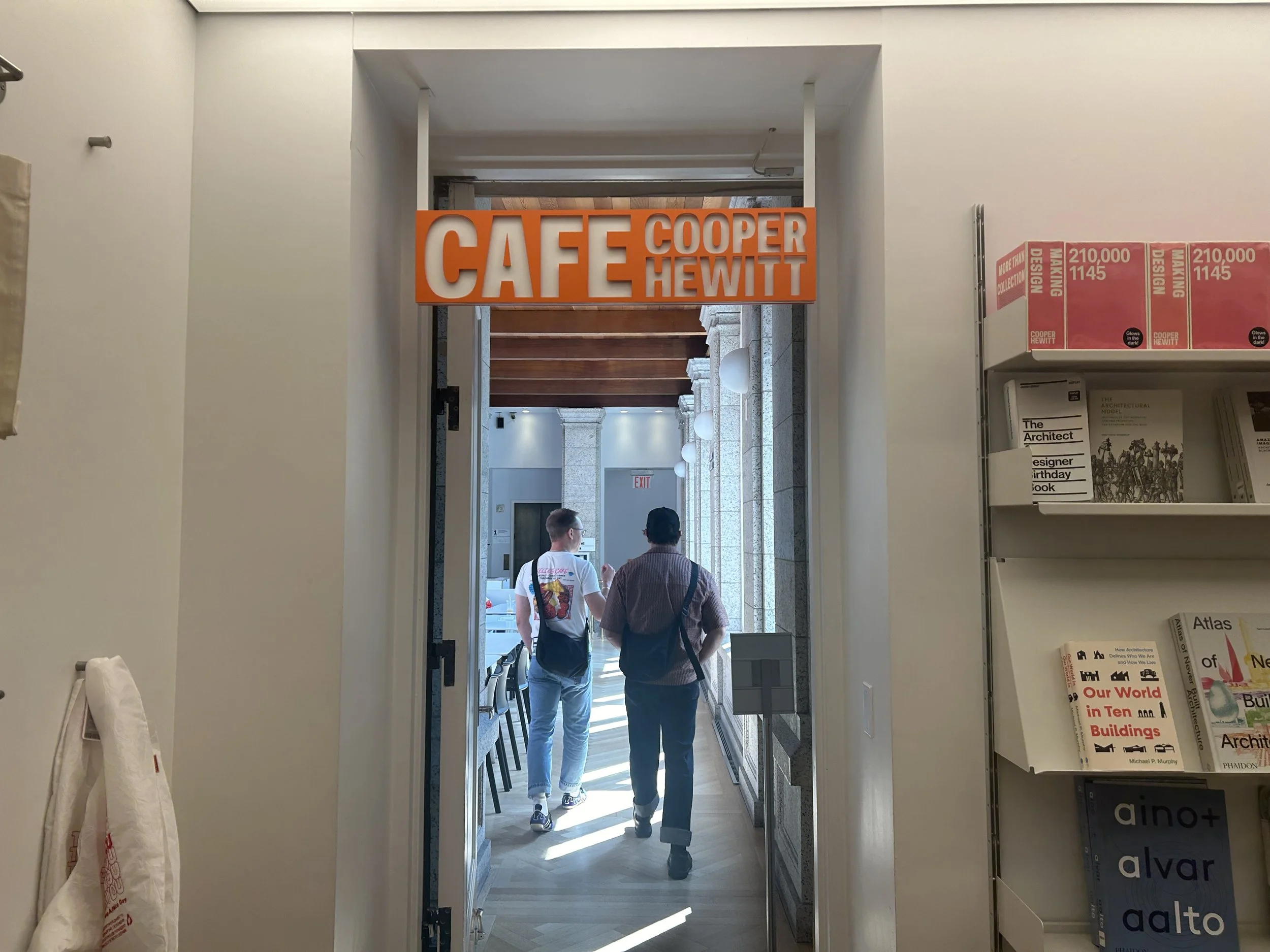
Later in my visit, wanting a drink, I took a lap around the first floor of the museum to locate the café advertised on signage. It wasn’t until I specifically moved further into the gift shop was I able to spot a sign previously obscured from the view of every entering hallway.
The wayfinding at the museum could be vastly improved just by adjusting and repositioning already existing artifacts. By improving wayfinding, the museum could better demonstrate and provide access to its free amenities (the café, shop, and garden). This distinction is only obvious when entering the property through the garden, using the 90th street entrance, rather than the main 91st street entrance which enters through the Great Hall into the first floor exhibit.
The solution. An audit of two key visitor journeys reflecting my experience demonstrating six decision points (DP-01 to DP-06) and proposed solutions to each (IN-01 to IN-06).
The plan was drafted in AutoCAD based on floorplans of past exhibits found online. The proposal aims to redirect visitors at confusing intersections and ambiguous moments, starting with the two large digital screens that greet visitors in the Great Hall.
-
Admissions sits to the left while the architecture encourages visitors forward, into the main exhibit.
Solution: Display a wayfinding band on the existing digital screens, directing visitors to the real first step.
-
Current stanchions provide nothing but ambiguity.
Solution: Increase signage, clearly labeling where to queue and what the tables are for.
-
A lack of signage makes the decision of where to go first difficult.
Solution: Large sign in the Great Hall visible from the Admissions area, with descriptions and directions of each exhibit.
-
Entering the rotunda, no signage means it’s unclear what comes next. Existing signage serves visitors entering the rotunda from the shop, but not the other way around.
Solution: Add small signs indicating shop entrance, and café through shop.
-
The existing café sign is almost impossible to see from the rotunda-entering angle, and is partially obscured from the hallway-entrance by a large glass display case.
Solution: Rotate the sign 90 degrees, and remove bright, distracting objects in its vicinity.
-
Outside of the partially hidden sign, visitors have little knowledge of what lies past the doorway.
Solution: Place a menu stand, hour information, and “Garden through Café” sign near the door.
Research & Discovery
Decision points. I traced the two visitor journeys where I had gotten lost & noted decision points along the way.
At each decision point I audited what cues exist, what cues were missing, what the layout of the building itself implicitly said, and how these cues contradicted or worked together to support the visitor experience.
I photographed points of interest and reconstructed the first floor in AutoCAD before annotating in Adobe Illustrator. On my second visit, I verified the sightline findings and observed real visitor behavior.
Journey A. Arrival → Galleries
Journey B. Galleries → Café
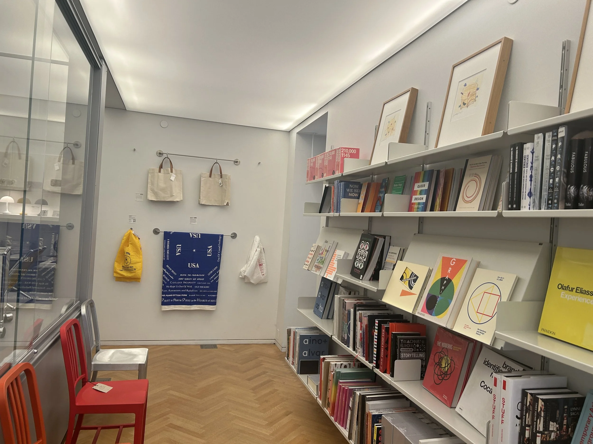
The sign is just within this doorway, perfectly obscured by a row of books.
DP-01: “Where do I get tickets?”
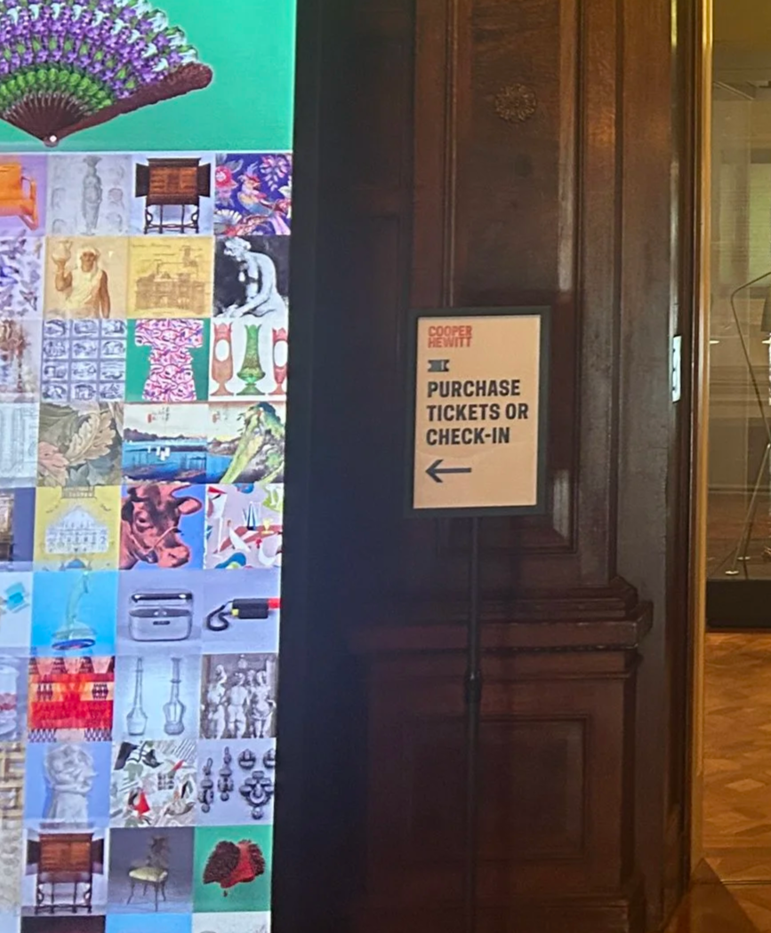
From the entry stairs, visitors are greeted by a large door headed with Design Across Time (the title of the current exhibit) and two large digital screens, which encourage the visitor to continue straight forward into the galleries. While the screens show close ups of artifacts and advertise current exhibits, the first task (ticketing) is announced by a comparatively tiny paper placard.
DP-02: “How do I approach the tables?”
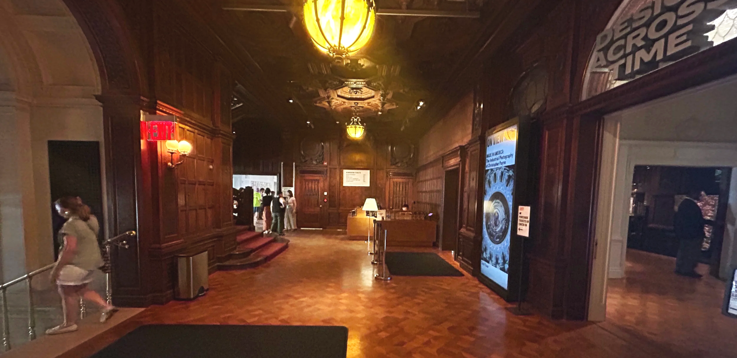
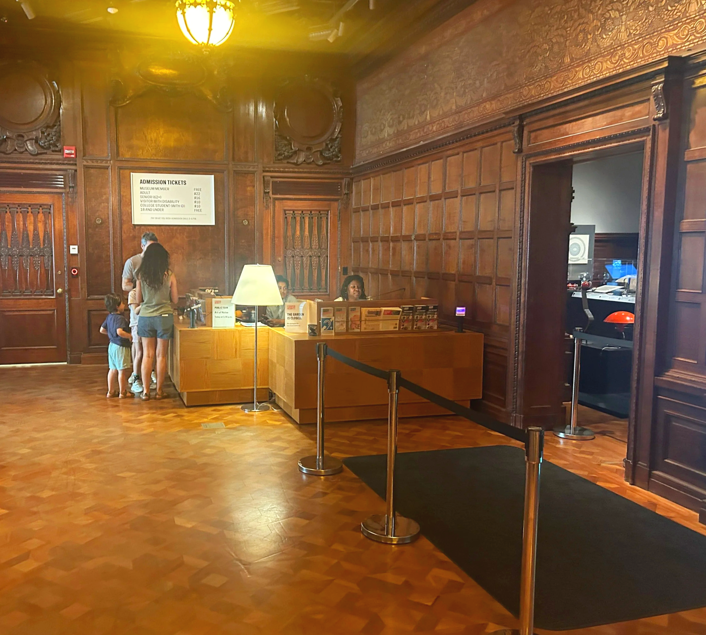
The admissions area has stanchions, but with two distinct yet identical tables, it’s unclear how to approach. From observation, I noted visitors approach the area from both sides and directions (usually approaching whichever table is closer), and visitors walking down the stairs enter straight through the stanchion gap.
DP-03: “Now where do I go?”
After paying for admission and receiving a small sticker, visitors must either backtrack to the main or secondary exhibit entrance, continue straight into the hallway to the shop, or go up the stairs without much idea of what to expect.
DP-04: “How do I find the café?”
Entering the rotunda from the main exhibit, visitors find themselves in a transitory room. Existing signage is pointed to visitors entering the rotunda from the shop, but not the other way around. Clearly, this wasn’t the intended direction, despite originating from the main exhibit.
At admissions, I listened as the staff filled the gap verbally, telling visitors to “go down to where you get the coffee”. Visitors are aware of the café, and it’s even used as a navigational landmark, but it’s hard to find from this direction.
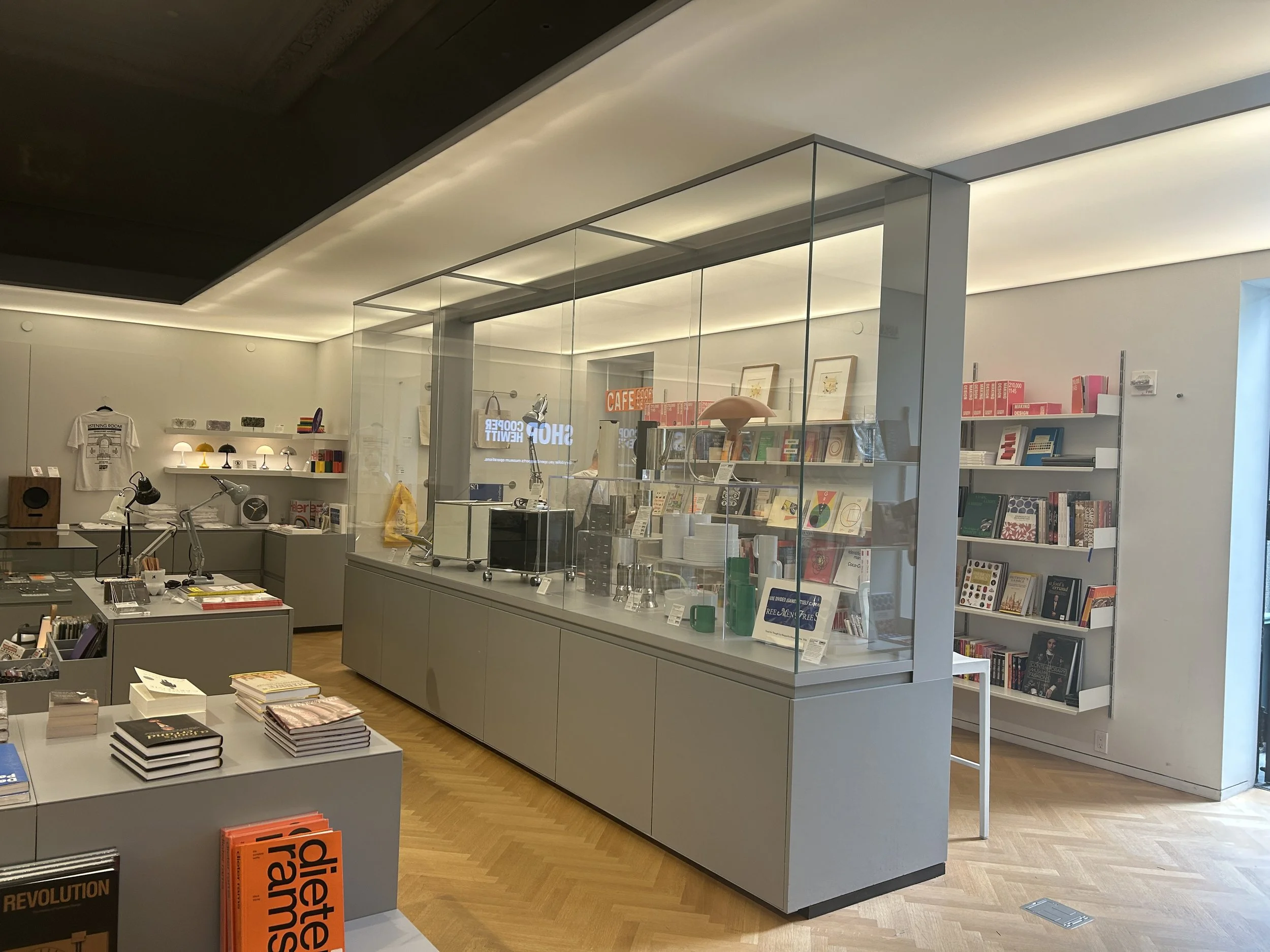
The sign is partially obscured by a glass cabinet. A few steps to the right, it is completely obscured by a lamp.
DP-05: “Should I go through here?”
Even after entering the shop, visitors have no knowledge of the route to the café, which is completely obscured from the rotunda entrance.
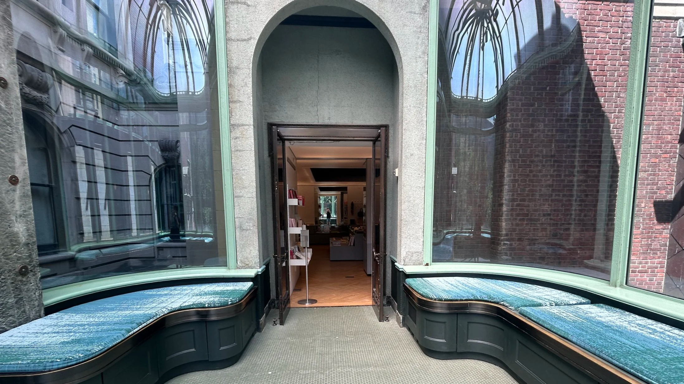
While there is a sign labeling the hallway to the cafe, the fact that it is tucked inside the doorway flush against the wall makes it impossible to see. When exiting to the hallway attached to the Great Hall entrance, signage indicates the direction of admissions, but no mention of the cafe.
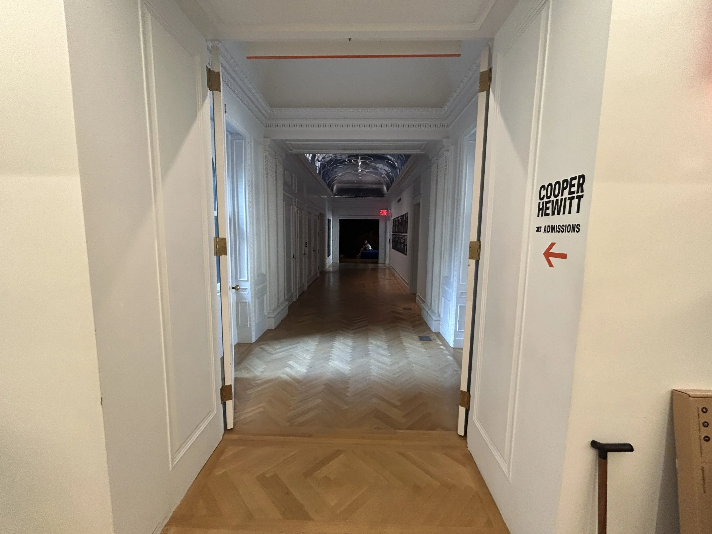
The hallway connecting the shop to the Great Hall. Visitors exiting the shop from here may have no idea that a café exists at all.
DP-06: “Can I go through here?”
Finally, when in front of the café sign, the only supplementary signage is again facing the other direction. The café sits beyond stairs at the end of a narrow hallway, and no menu, hours, or indication that a garden is accessible through the café exists here.
The alternate journey. Much of the existing signage, facing backwards, indicates that I went “the wrong way”.
On my second visit, I entered through the 90th street entrance through the garden. Through the gate, there was nothing but a simple bag check. After asking the staff, I learned that the garden, café, and shop, are completely free to access and did not require a ticket. (Perhaps most visitors only use the free amenities, and thus enter through the garden side.) If visitors wanted to purchase admission, they could walk from the garden through the café and shop to the Great Hall (the small sign at the rotunda indicated visitors needed a ticket to enter) to purchase tickets there.
Outcome & Reflections
What this would change.
Improving cognitive artifacts would reduce the burden on staff members on directing lost visitors. Visitors would be able to more freely and organically discover new exhibits and amenities, and thus more people would be able to actually make use of them.
How I would measure it.
I would standardize my observation periods to include several behaviors, including visitors walking around stanchions or through gaps, pausing or hesitation in the Great Hall, and staff providing verbal directions to supplement or replace physical signage. If provided the opportunity, I would analyze visitor activity in the café, including how many people enter from the garden as opposed to the shop, and what proportion of museum guests are ticketed visitors.
Limitations.
As a single subject over the course of two visits, I was able to verify sightline findings (with photos) and briefly observed behavioral patterns. Continuing this project, I would interview staff and visitors and conduct more standardized observation.
Reflections.
On my second visit, by approaching from an alternate direction, I was able to understand some of the signage decisions that previously alluded me, like the small sign in the rotunda serving to block unticketed visitors from entering. However, by traveling the museum from both directions, I was able to experience firsthand some tradeoffs and friction in the transition between each room.
Additionally, The Cooper Hewitt’s unique history (located in a historical mansion) places limitations on how much freedom exhibit and museum designers are given to provide the best visitor experience. The building was renovated in 2014, during which several interactive and immersive features were added to the higher floors. The exhibits on the higher floors had a more open layout and flexible flow, which I think benefited the visitor experience. Unfortunately, I think the fact that the building was not initially designed as a museum is most apparent in the awkward layout of the first floor, which more faithfully preserves the original architecture..